8 NHL Jerseys and Uniforms We Never Want to See Again
No sport polices its fashion like hockey.
So, while some will lean toward celebrating the NHL's contributions to haute couture, some others will channel their inner Joan Rivers along the runway—or perhaps Statler and Waldorf from the balcony—while lobbing critiquing grenades toward the merchandise rack.
And because not every team gets rave reviews upon taking the ice, the B/R hockey staff decided to follow up its recent offering of eight great jerseys from teams that no longer exist with another collection, this time of the jerseys we hope we never see again (with one other piece of gear thrown in for good measure).
There are no definitive wrong answers when it comes to diagnosing what's right or wrong in fashion, so take that into account as you click through, and make sure to drop a thought or two of your own in the comments.
8. Buffalo Sabres: 2013-15 Alternate
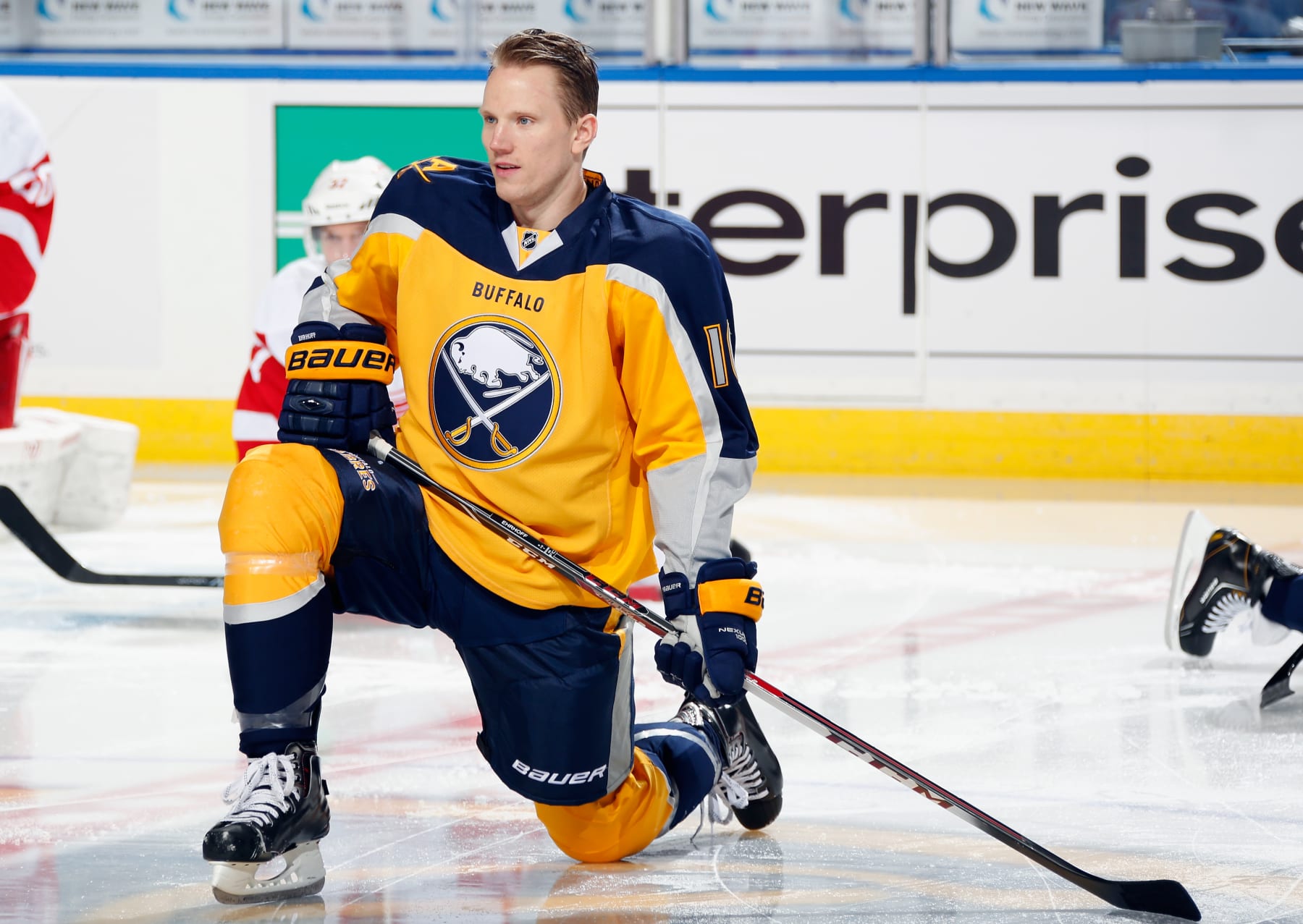
The Buffalo Sabres arrived to the NHL in 1970.
And upon doing so, they introduced the league to one of the best combinations of color scheme and logo that's graced professional ice in the last 50-plus years.
But for whatever reason, that's not always been good enough.
That was the case from 2013 to 2015, when ownership sought to use gold as the primary color and wound up with a two-tone gold on the front and navy blue on the back.
The city name appeared on the pant leg as well as just below the neckline on the main jersey, right above the crest. Unique fonts and art were used for numbers and names, too, but the entire mix seemed so wrong for a franchise that had, usually, gotten it so right.
7. Calgary Flames: 2011 Heritage Classic
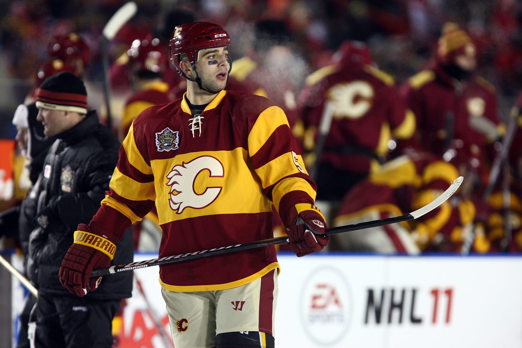
A rugby outfit. A McDonald's uniform.
Not exactly the reviews a team is seeking for a big-event jersey.
But that's what was in store for the Calgary Flames as they ramped up for the league's 2011 Heritage Classic at McMahon Stadium, home of the CFL's Calgary Stampeders.
Fortunately, it was a one-time only mistake for the Flames and the look for this year's event look was far superior. But the cream-colored pants beneath an ugly blend of ketchup and mustard on the sweaters is an on-ice vision that's difficult to un-see, even 12 years later.
6. Buffalo Sabres: 2006-10 Road
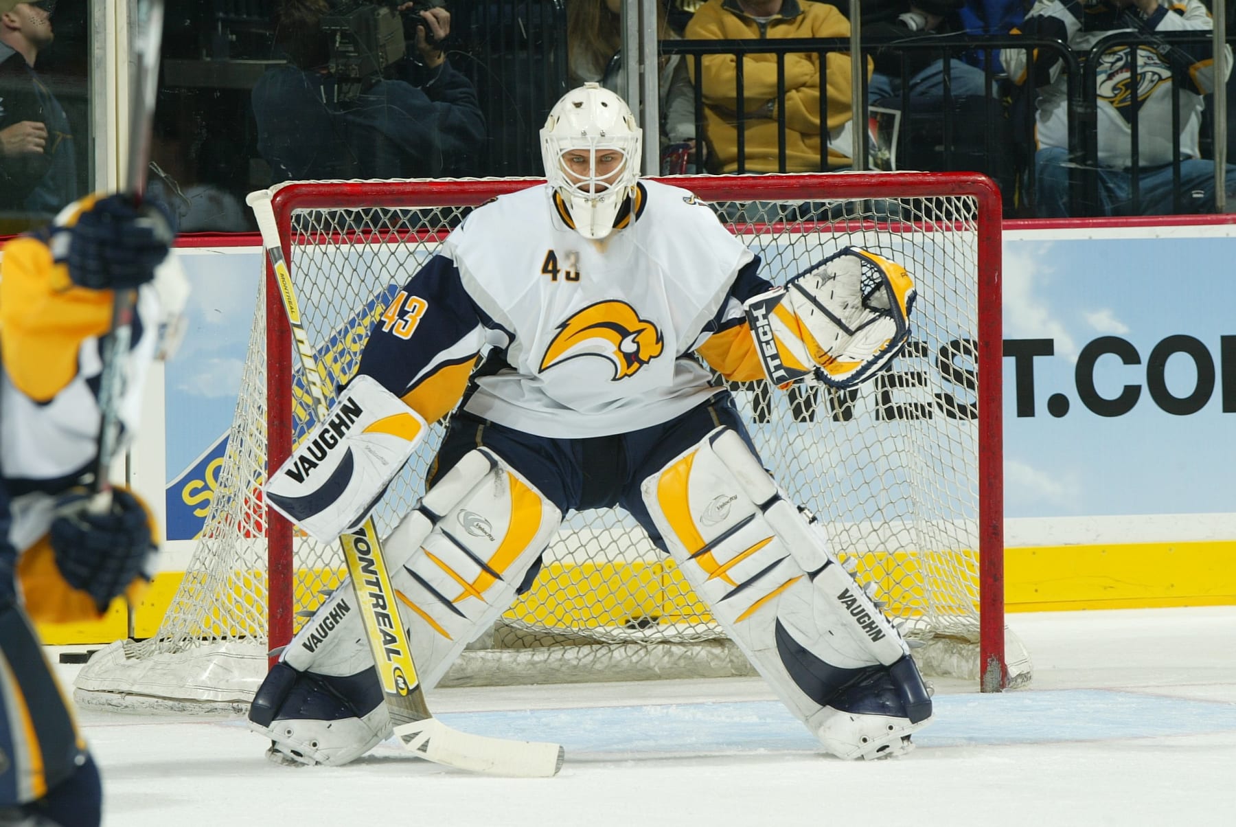
Yes, it's the Sabres again.
As mentioned earlier, some of the league's most classic looks originated in Western New York and were worn by the likes of Gilbert Perreault, Rick Martin and Rene Robert.
But the misses. Oh, the misses.
Fighting goat heads and weird two-tones are in the Buffalo hall of shame alongside the mess that served as the team's road jersey in 2006-07, perverting the original color scheme with what's not-so-lovingly remembered as the "Buffaslug" logo.
In design terms, it was envisioned as a progressively charging bison, sans legs and tail, with two horns and a red eye carried over from the goat head. But in response terms, it was mocked as a hair helmet better suited for Donald Trump or Barney Rubble.
5. Atlanta Thrashers: 2008-11 Alternate
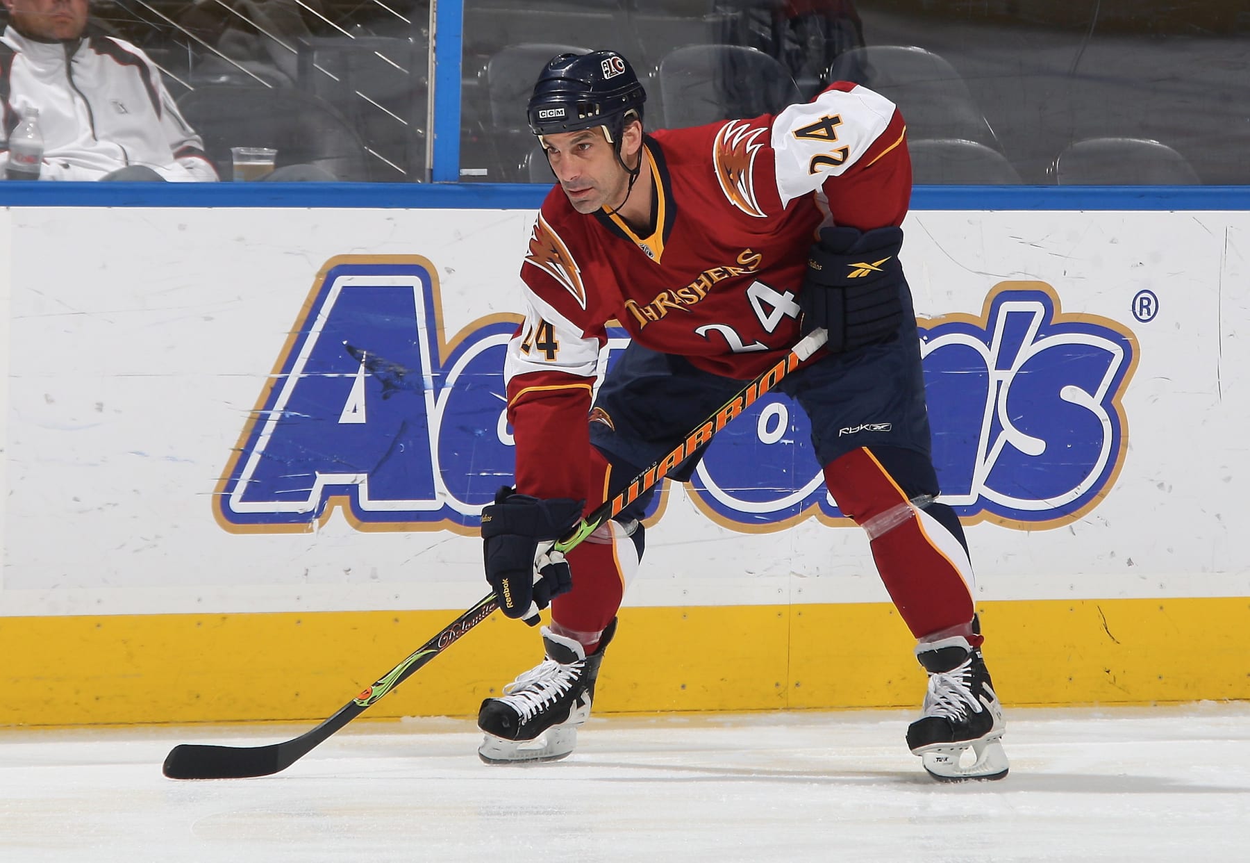
The Atlanta Thrashers don't have a lot of positive history.
They lasted 11 seasons in the NHL before relocating to become the league's second version of the Winnipeg Jets, making the playoffs once and never winning a postseason game.
And they never looked particularly good doing it,
That was certainly the case across those final three seasons when their alternate jerseys featured obnoxiously large bird heads on the shoulders, the word Thrashers arched on the chest above the numbers, or the very idea of numbers on the chest.
Not exactly a fashionable triple play for something that looked like it would have been more at home on a high school basketball court than an NHL rink.
4. Tampa Bay Lightning: 1996-99 Alternate
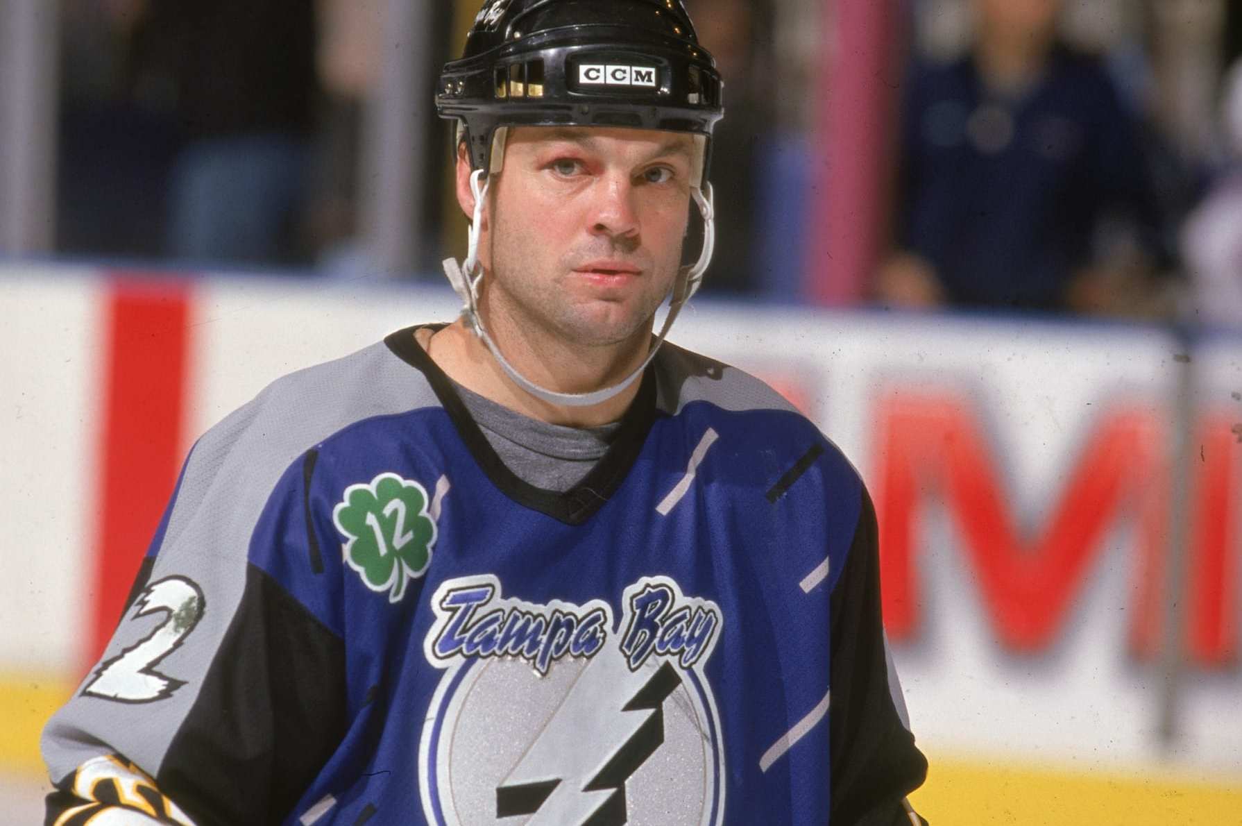
This one may lean on individual tastes
The creative thinkers on the margins might embrace the literal concept of a team that's called the Lightning and based within miles of the Gulf of Mexico taking a swing at a rainstorm motif with actual lightning and waves.
But as for the rest of us...meh.
Blocked off colors on the shoulders and sleeves give way to the storm on the torso complete with rectangular raindrops falling amid the aforementioned bolts and waves (third jersey in the tweet above).
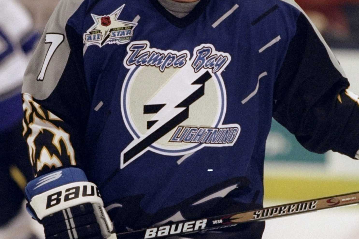
The numbers on the sleeves and the back go their own way with unusual textures, making the whole thing just way too progressive for an NHL appetite.
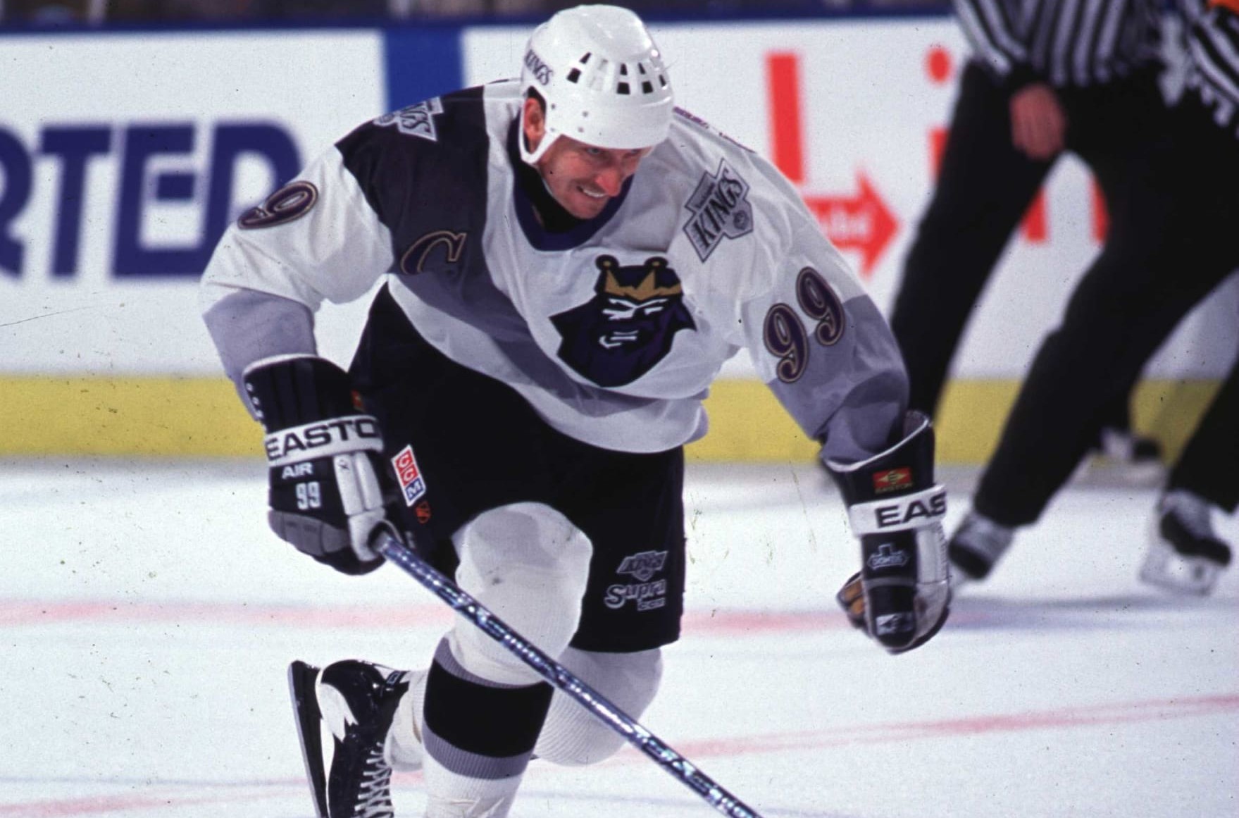
3. Los Angeles Kings: 1995-96 Alternate
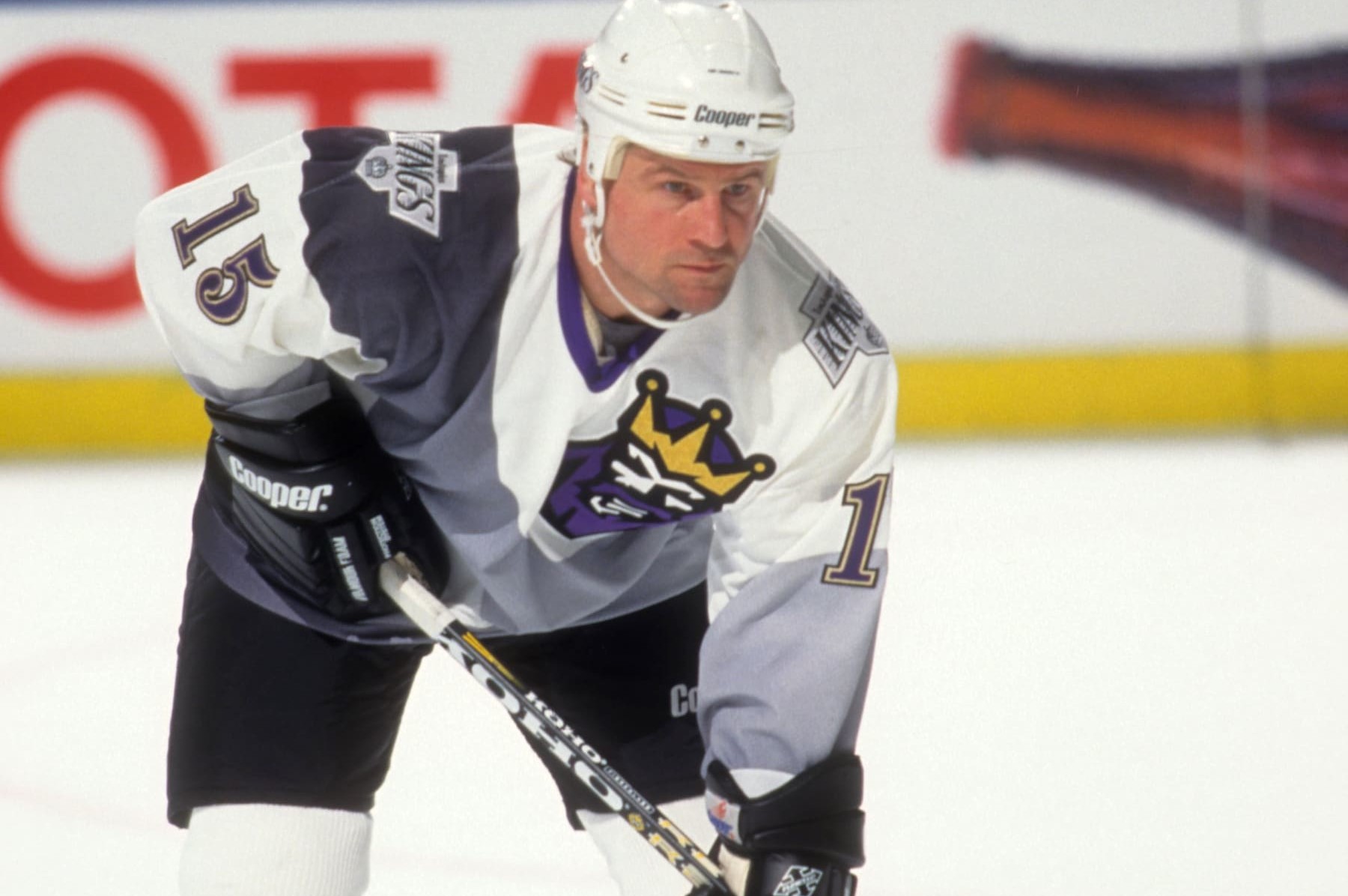
Somewhere Wayne Gretzky is cringing.
Even (nearly) 30 years later.
The "Great One" was a four-time Stanley Cup winner in Edmonton and one-time finalist in Los Angeles, and he played on the occasional also-ran, too.
But he never looked as bad doing it as he did in L.A. in the 1995-96 season.
It was then that the Kings' brain trust unveiled the "Burger King" collection, complete with a logo in the upper right portion of the chest (huh?) that was way too reminiscent of a hamburger-peddling royal.
Still, that wasn't the only disaster. The team's regular logo was attached on each shoulder amid weird swatches of white, gray and black that continued onto the back and made the numbers difficult to discern.
Fortunately for Gretzky, he was off to St. Louis before season's end. And as for the jersey, it died a merciful death at the end of the schedule, too. Never to return.
2. Philadelphia Flyers: 1981-82 Away
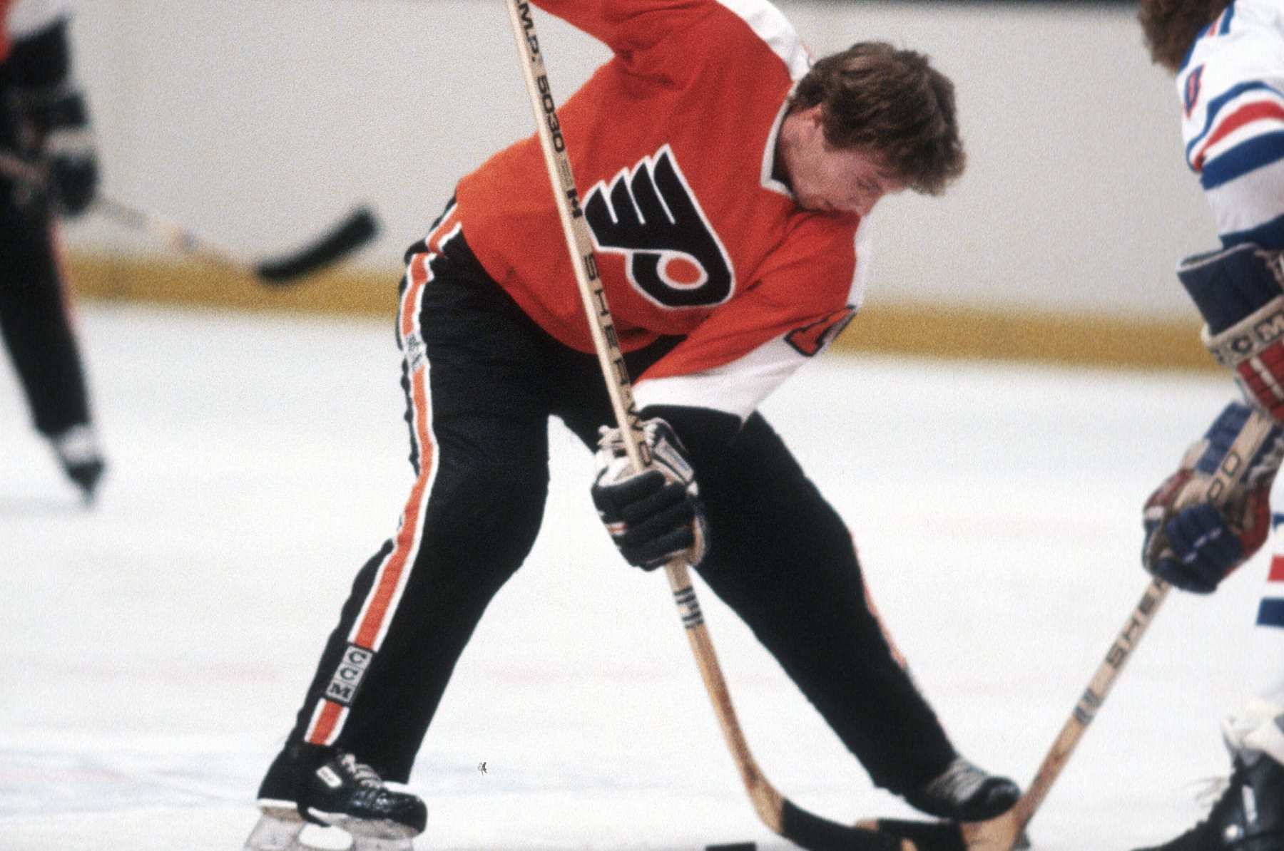
Fans of a certain age remember the "Cooperalls."
The Philadelphia Flyers introduced the concept of long pants to the league as part of their home and away uniforms during the 1981-82 season, and they were joined by the dear, departed Hartford Whalers the following season before the league pulled the plug.
And not a moment too soon.
Alongside complaints that suggested they compromised player safety by reducing friction with the ice, were too warm to wear comfortably, or were an unfair impediment to goalies finding it difficult to track the puck against them, there's another reason they had to go:
They were just ugly.
They reduced the coolest game on ice to a bunch of guys skating in jogging pants, and images of a helmetless Bobby Clarke wearing them with advertisement-free boards in the background look like they're from an era that should be much farther back than it actually is.
Unfortunately for us, the Carolina Hurricanes will wear them during warm-ups for Whalers night on Feb. 10.
With any luck, they will eventually be forgotten.
1. Montreal Canadiens: 2009 Throwback
We get the concept.
The Montreal Canadiens were channeling their 100-year-old selves in 2009.
But that doesn't explain away the look that is, by leaps and bounds, the most ridiculous in the history of the league.
Let's face it, the day-to-day outfits worn by the Canadiens are arguably the league's best and at least certainly on a short list of candidates. So any deviation from that norm, regardless of reason, is almost always doomed the failure by comparison.
Still, these went way beyond that.
Imagine going to bed after a dream-inducing meal and waking in a cold sweat to see Guy Lafleur or Larry Robinson or Kenny Dryden taking the ice at the Forum clad in a chaotic blend that's the fashion love child of a barbershop pole, an 1870's swimsuit, and a Where's Waldo cartoon. That's the image that can't help but be left by this disaster.
And no, absence will not make the heart grow fonder.