Ranking the NHL's Best Stadium Series Jerseys
Call it the Golden Globes of hockey fashion. Unlike the Stanley Cup playoffs, where the sartorial tendencies lean toward Oscars-like formality, the NHL Stadium Series provides a chance to experiment with design.
Want to play with your logo or massage your color scheme? Have a go at it.
If it's a hit, it'll be talked about for years; if it's a miss, don't worry, it'll be forgotten in a week.
The B/R hockey team leaned toward trendsetting for its pre-weekend task of listing the top Stadium Series jerseys since the outdoor games became an annual tradition in 2014.
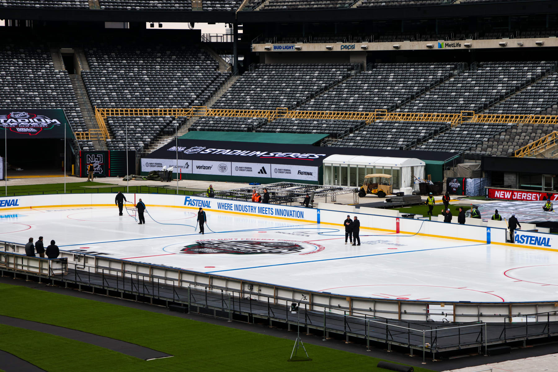
Seventeen teams had participated at least once through 2023 and the four playing this weekend—Philadelphia, New Jersey, New York Rangers and New York Islanders—are back for either a second (Islanders, Devils) or third (Flyers, Rangers) time.
By weekend's end, there will have been 29 jerseys worn in the Stadium Series setting, and we've picked the eight best based on logos, colors and overall design vibe.
Take a look at what we came up with and drop a thought of your own in the comments.
8. Los Angeles Kings, 2020
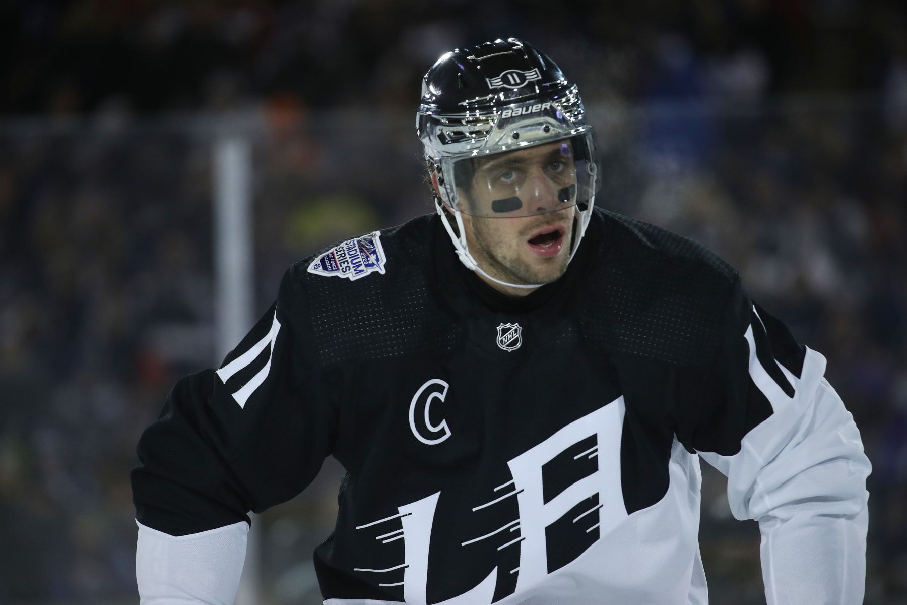
The Los Angeles Kings have played in three Stadium Series events, but the ensemble they wore for the 2020 game at Falcon Stadium in Colorado Springs was the best of the bunch.
The chrome helmets alone lift it to the elite level.
And given that the game was played at the Air Force Academy's home stadium, the black-and-white color pairing with a modern L.A. crest were a fitting tribute to the P-51 Mustang fighter jets that had been built in southern California factories.
7. Philadelphia Flyers, 2017
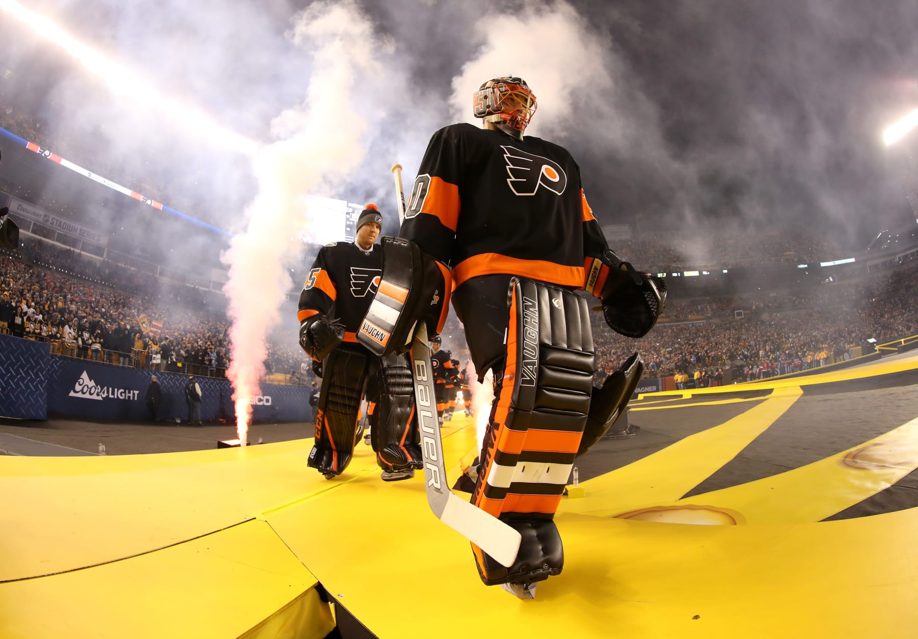
The Flyers clearly consider outdoor games as a fashion runway.
The jerseys they wore to play the Pittsburgh Penguins at Heinz Field in 2017 became part of the team's rotation in the 2018-19 season, following a script established when Philadelphia took part in the Winter Classic games in 2010 and 2012.
The uniforms are basically black with orange armbands and nameplates, a combination that is particularly eye-catching and accentuates what's long been one of the NHL's best logos.
6. New York Islanders, 2014
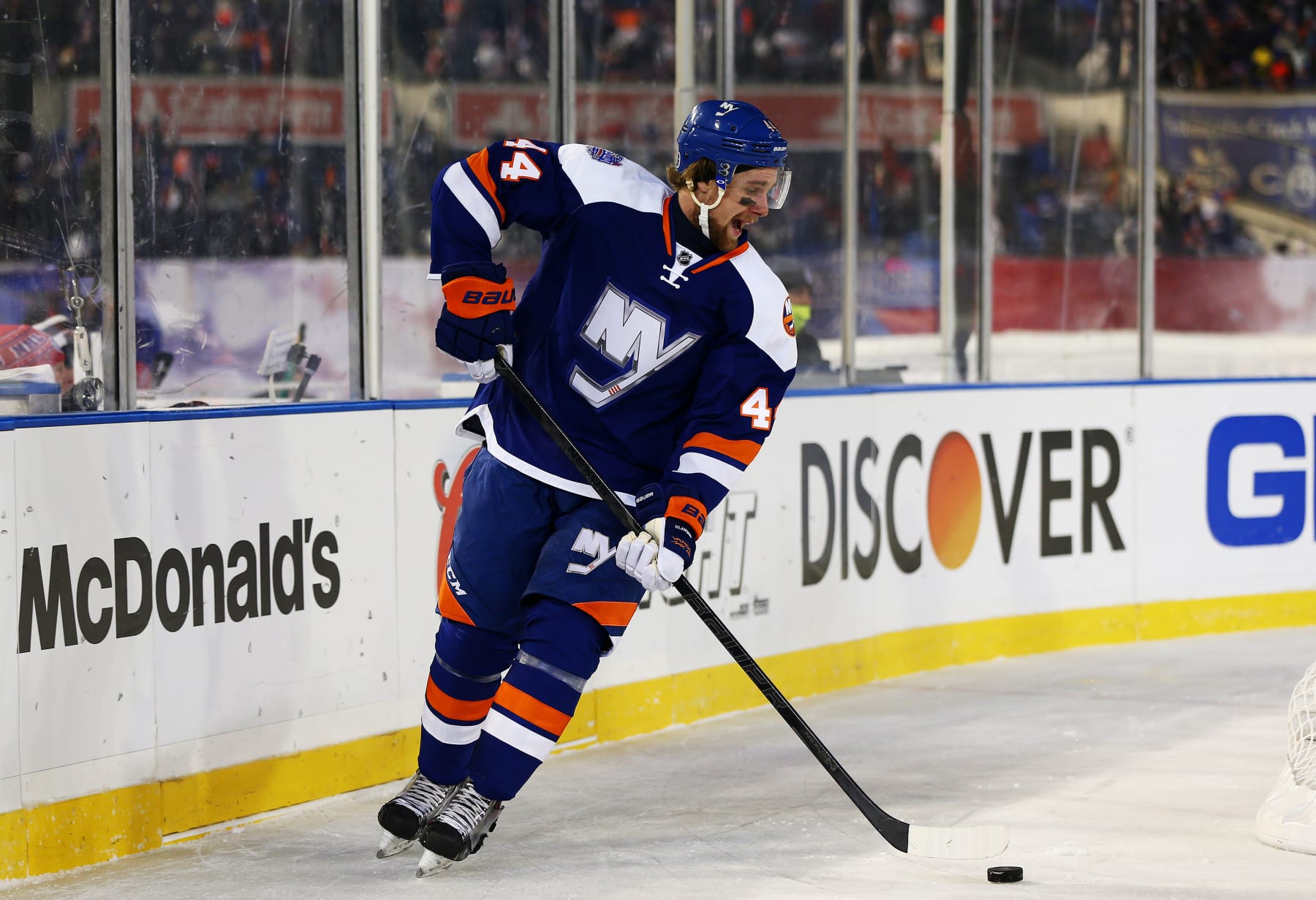
Like the Flyers before them, the Islanders went from wearing this one in a January 2014 game at Yankee Stadium to making it an alternate for the 2014-15 season.
Even now, after the franchise's move to Brooklyn, the sizable NY logo with four stripes on its stick blade remains a visual centerpiece of the 2023-24 alternates.
The color scheme back then strayed from a leaguewide lean toward black while still feeling like a trend-setter with just the right mix of white and orange with a blue base.
5. Pittsburgh Penguins, 2019
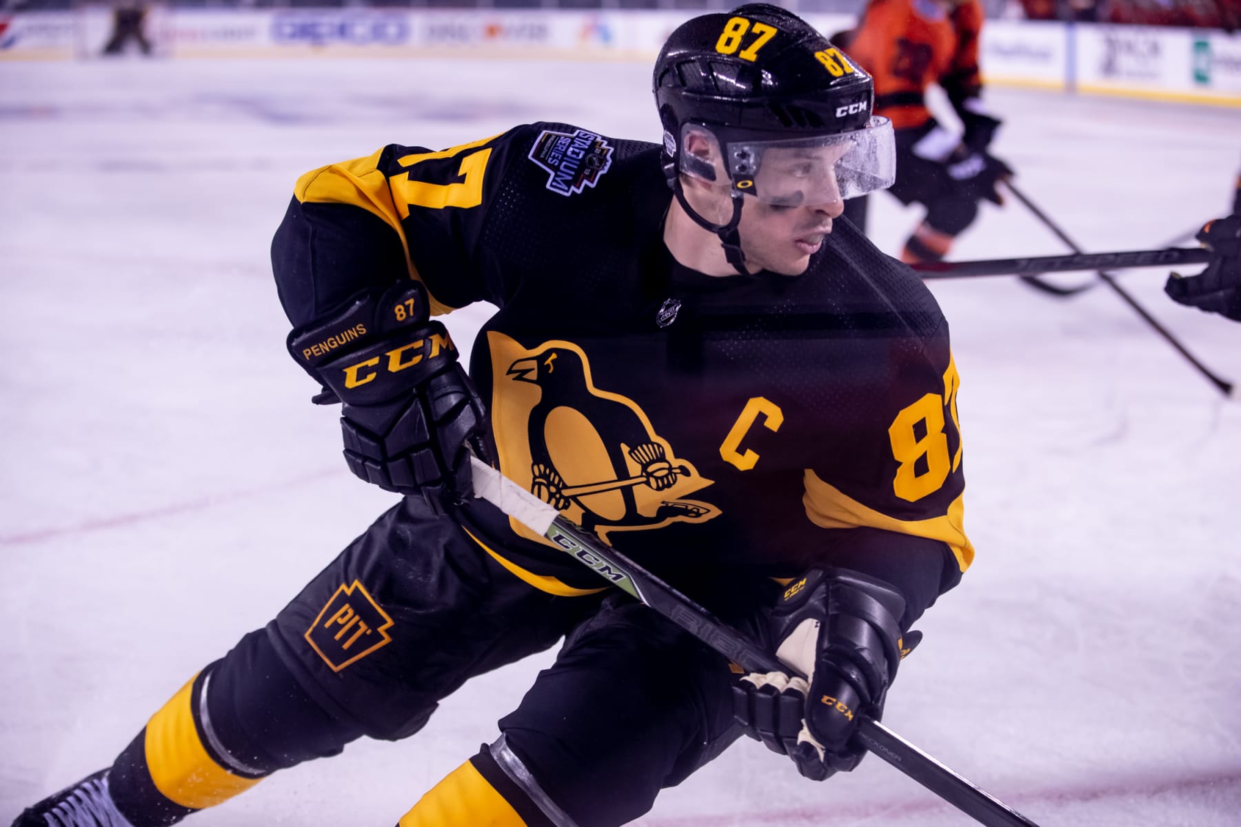
It's not complicated, but there's a lot to like.
From the Pennsylvania Turnpike-inspired "PIT" patch on the pant leg to the familiar logo in solid yellow to the signature black-and-yellow color scheme from head to toe, this one screams "modern classic."
And to top it off, the back necklines include a block letter stencil of the "A Great Day for Hockey" phrase made famous by former coach Bob Johnson.
Subtle but brilliant.
4. Colorado Avalanche, 2020
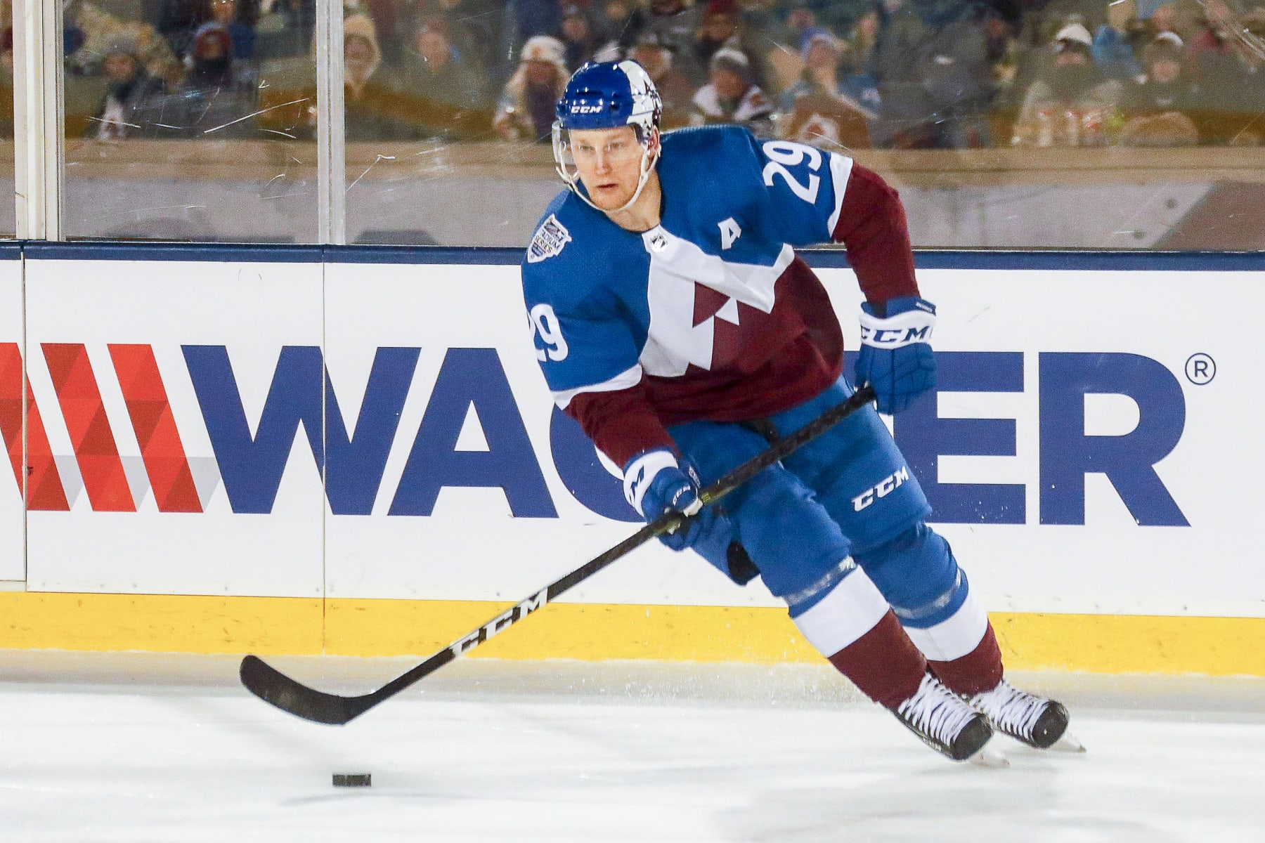
The Kings set the fashion bar high for the 2020 game at the Air Force Academy, and the host Avalanche didn't just meet it, they raised it.
It's not everyone's cup of tea and represents a sizable departure from the design they'd sported in the 2016 event, but the giant rocky mountaintop crest is nothing if not striking and the clever use of negative space is a callback to the old-school Colorado Rockies look.
Blue pants and gloves keep the color scheme logical, and the look is topped off with stellar helmets that echo the look and include numbers.
3. Anaheim Ducks, 2014
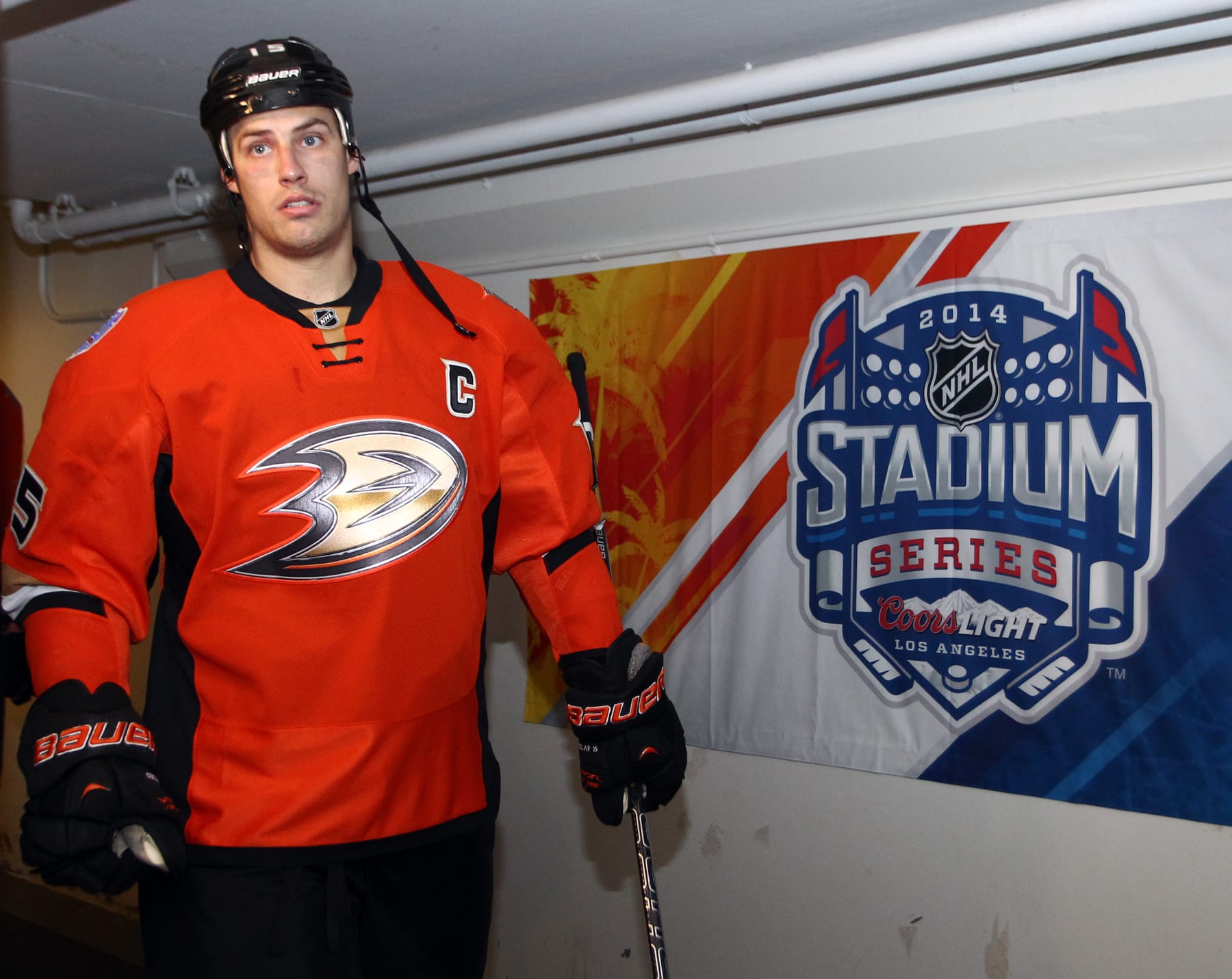
Fortune favors the bold. And we're rewarding the Ducks for it here.
First off, the orange base makes this one impossible to ignore, and the logo—which is strong enough without any gimmicks—looks particularly cool with the chrome treatment.
Extra points, too, for the black neck strings.
The trip to Dodger Stadium to meet the proximal rival Los Angeles Kings pretty much warranted a local touch, which was handled via the "OC" patch that called out Anaheim's home in Orange County, about 25 miles southeast of Los Angeles.
Bravo.
2. Washington Capitals, 2023
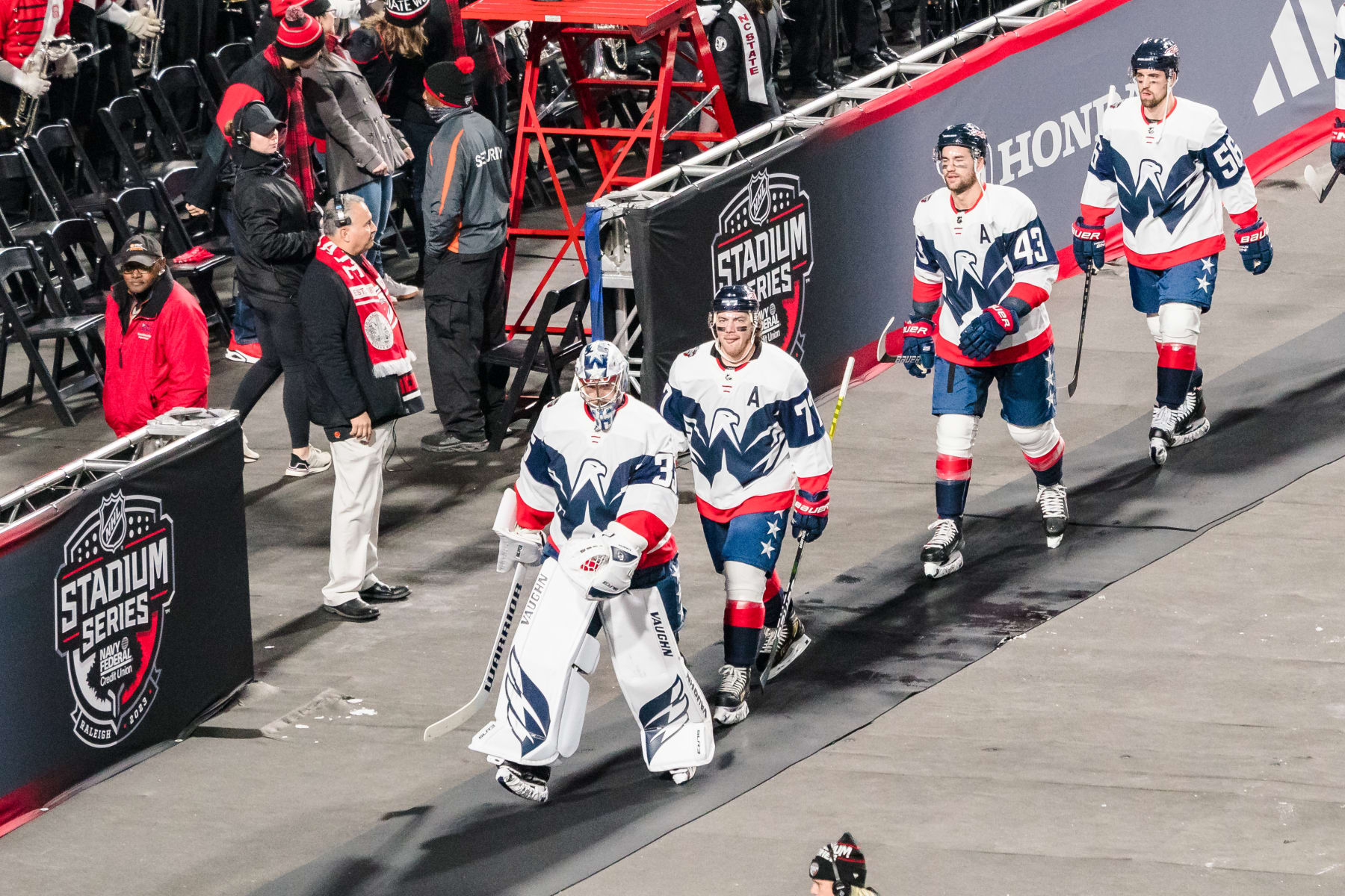
When it comes to jerseys, the Capitals have failed as often as they've succeeded.
However, this one is a definitive win.
The eagle-dominated logo is at the apex of unique looks and blends perfectly into the numbered, striped sleeves. It had played a supporting role in previous designs for the team but flourishes in its front-and-center star turn.
And we can all pretend we knew this all along, but how many people actually noticed the outline of the U.S. Capitol building in the negative space underneath?
That's why fashion designers get paid the big bucks, folks.
1. Chicago Blackhawks, 2014
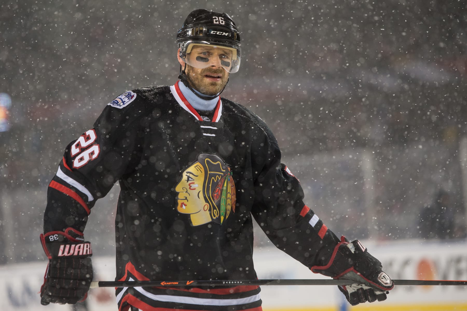
Chicago is no stranger to the league's special-event games.
It's been represented in the Winter Classic four times (2009, 2015, 2017 and 2019) and hit the ice in the Stadium Series in 2014 and 2016.
The 2014 collection gets the top-end fashion nod here, though, thanks to its classic simplicity.
Black isn't always effective when it comes to jerseys, but it works well here because of the way it makes everything else pop. The red-and-white stripes at the base, on the sleeves and the neckline are accentuated, not to mention the neck strings and the logo.
It's not only the franchise's best effort across a prodigious history of outdoor appearances, it's better than anyone else has ever done it, too.