Ranking the Helmets of the PAC-10
Ranking the helmets of the PAC-10 conference.
Honorable Mention: Colorado
Since Colorado is not yet in the PAC-10 (soon to be the PAC-12) I won't rank their helmets.They go well with their uniforms but the gold almost seems to have a green tint to it sometimes.
Honorable Mention: Utah
Since Utah is not yet in the PAC-10 (soon to be the PAC-12) I won't rank their helmets. They tweeked them a few years back but it doesn't look very different. It also fits well with their uniforms.
#10 Oregon State
My problem with the Beavers helmets is that black helmets can look very fierce and Oregon State's helmets are not. They are just black and orange with that silly looking beaver.
#9 Washington State

Ok the cougars seem to change the writing on their helmets every year and for that they get marked down. This year they will be going with silver at home and crimson on the road with WSU cougar on the side of both. I thought the cougar script on the side looks much better and they did away with that for this year.
#8 Washington
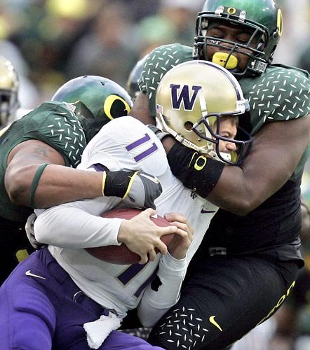
There is nothing really wrong with the Husky's helmets.They have had the Gold helmets with the purple W for quite a few seasons.... before and after the 1990's but maybe a winning season would help give them back their luster.
#7 USC
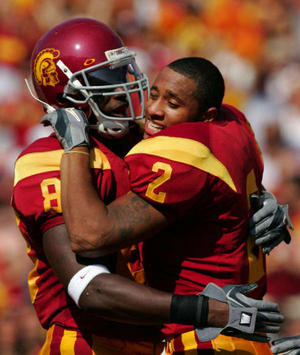
Major points taken away for the gray facemask. They are basically the same helmets they have had for years. They need to be updated a little bit like the uniforms were a few years back.
#6 Cal
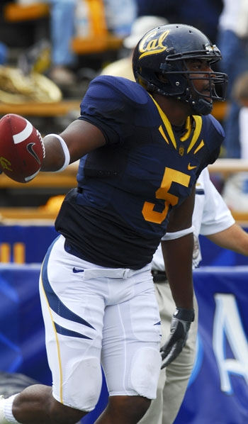
Yale Blue and more Yale Blue.With just a touch of California gold. They work for Cal. They accent the blue and white uniforms very well. The gold uniforms not so much.
#5 UCLA
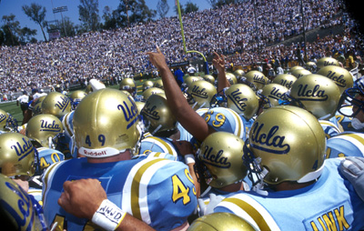
UCLA it seems is always just barely changing the shade of blue on the stripes or numbers on their uniforms. It makes the helmet script look out of place. But the helmet is classic and I love the way it looked against USC when both teams wore their home jerseys.
#4 Arizona
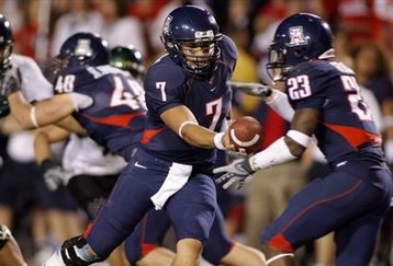
Major upgrade from the previous white helmets. Although now they brought back the white helmets.The blue ones are very much more pleasing to the eye. They are updating the helmets again this season with pixelated stripes. I'm not sure how good that will look.
#3 Arizona State

Very simple. One stripe with Sparky. Major points for matching the facemask with the stripe. Sparky is one of the most original mascots in all of college football so points for having him on the helmet. I would love to see them come out with an alternate maroon helmet.
#2 Stanford
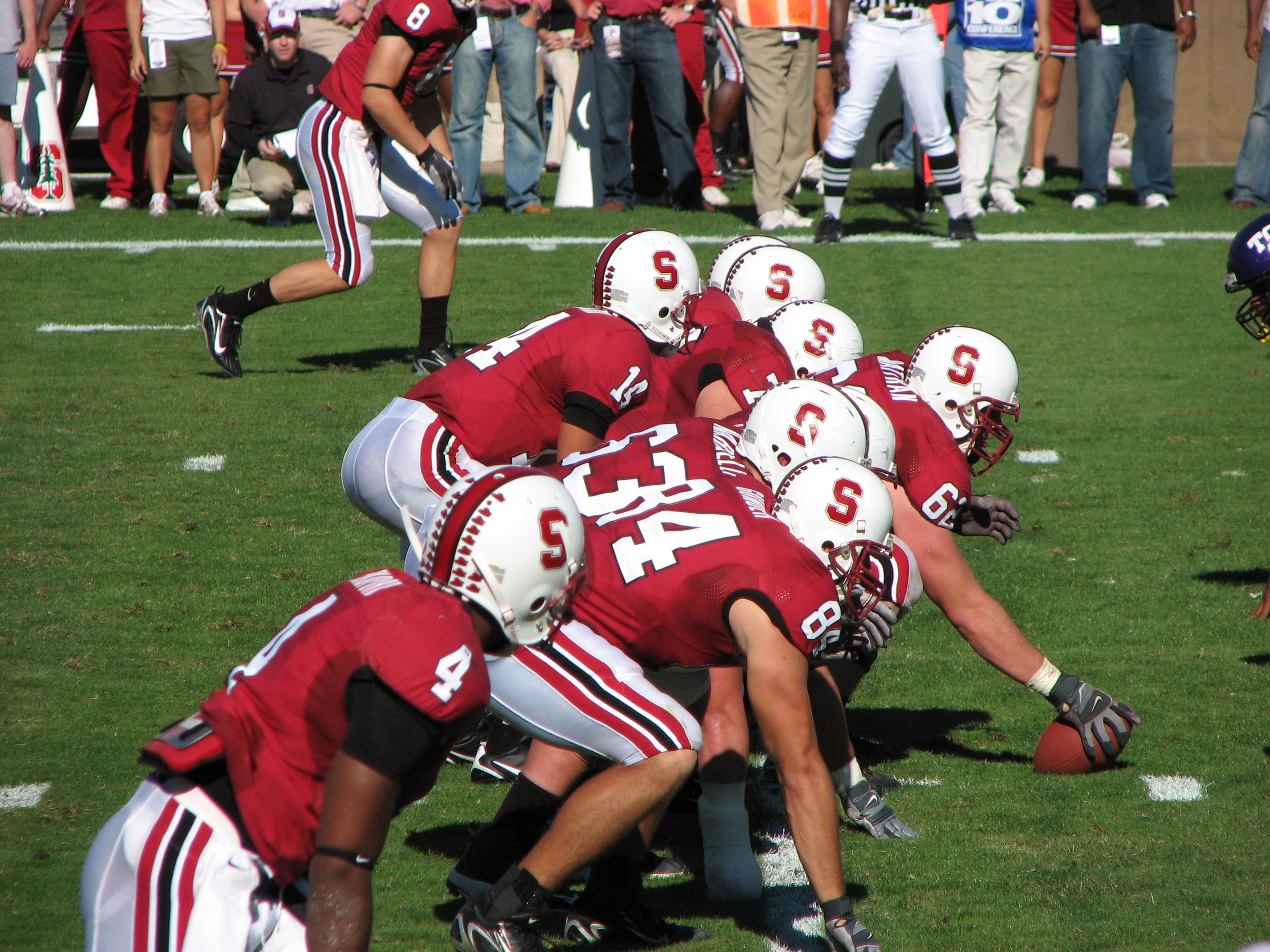
Probably the cleanest look in the whole PAC-10. Cardinal and white with the Stanford S.
#1 Oregon
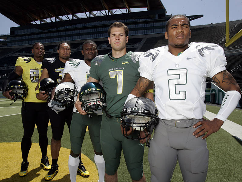
Now I'm sure some people will scream bloody murder at Oregon being #1. But credit is due to a team that has 4 different helmets and can make any of them look good. My personal favorite is the green helmet with the yellow O. Very clean and powerful.