No Worse for Wear: Minor League Hockey's 20 Best Jerseys of Modern History
When it really comes down to it, minor league hockey is not about winning the Calder Cup, Adams Cup, or the like. It's about preparing the next generation of NHL superstars and giving them the development they need to perhaps eventually go on to win the Stanley Cup.
However, from our perspective, minor league hockey also gives us a massive collection of jerseys to examine. Nearly a hundred teams from a multitude of minor leagues have all designed home, away, and alternate jersey, and even just over the past few years, the range of styles and color schemes is tremendous.
From the American Hockey League to the East Coast Hockey League to the Central Hockey League, the jerseys that some teams have created make the National Hockey League look well behind the times. It may be the minor leagues for the sport, but these teams are definitely in the major leagues of uniforms.
Even with "home whites" - unlike the NHL, all minor league games have the home team wearing their white-themed outfit - it's amazing to see the variety that exists within these leagues. We pick out our 20 favorite jerseys and put them under the microscope in this slideshow.
Note: All jersey images courtesy of Chris Creamer's SportsLogos.Net.
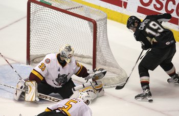
20. Bridgeport Sound Tigers (AHL) 2001-02 Home
Pros: Bridgeport manages to use the navy-and-orange color combination very well without getting too close to their parent Islanders' jersey. We really like the logo, especially the blue splashes of water around the creature's neck and the orange trim around the numbering.
Cons: There isn't a lot of inventive designs on this outfit with no special distintive quirk. Still, a very solid all-around jersey.
19. Cincinnati Cyclones (ECHL) 2008-09 Away
Pros: As always, the near-complete black impresses us, as do the curved red lines along the sleeves and neck. The slanted, shadowy number is very cool, also.
Cons: Personally, the cyclone wielding a dangerous-looking hockey is quite dumb to us. We also aren't fond of the racecar-style "Cyclones" at the bottom of the back side.
18. Lake Erie Monsters (AHL) 2009-10 Alternate

Pros: The primarily black design gives a quite intimidating look to the uniform, with hints of blue and red thrown in to add the Monsters' own little flair. Without the text "Monsters" below it, that's certainly one of the most original logos around.
Cons: Again, nothing very exciting about it. Still, it's hard to find many faults in this design.
17. Elmira Jackals (ECHL) 2006-07 Home
Pros: As it seems to be with all of our favorite jerseys, Elmira brings a top-notch, unique logo to the table to compliment an already-well-rounded uniform. The wavy stripes along the sides of the front and back sides are a nice touch, as well as the diagonal lines along the torso-covering area of the jersey.
Cons: The lower half of the jersey is somewhat bland for our liking. Other than that, though, we can't see any issues at all.
16. Portland Bruins (AHL) 2007-08 Home

Pros: With a name and logo like Providence's, we expected a near photocopy of the Boston Bruins' jersey. However, that's not part of this package.
This design makes the Bruins' buttery yellow staple color mesh perfectly with the bright white theme of the uniform. The yellow stripe trimmed with black on the undersides of the arms adds an additional feature.
Cons: As we mentioned, it does verge on similar grounds to the real Bruins outfit. Nonetheless, we like seeing white truly stand out in this home jersey.
15. Alaska Aces (ECHL) 2007-08 Home
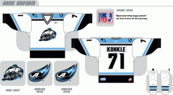
Pros: The sky blue secondary color is absolutely fantastic with the white base and black trim; it earns this jersey a spot in our favorites just by itself. The swiping bear on the logo, however overused, is also a fitting and attractive addition.
Cons: The blue snow-like speckles on the sleeves are too small to be noticeable and yet they're all the same, an odd feature of an otherwise great design. The gray rectangle around the name is also somewhat unnecessary.
14. Florida Everblades (ECHL) 2009-10 Home

Pros: One of our favorite teams in general simply because of their incredibly original and actually humorous name also sported a great jersey, at least for the 2009-10 season.
The increasingly darker shades on the ends of the sleeves are a top aspect, and we also enjoy the teethy stripe along the waist as well as the upright, green-trimmed number that they love to show off (it's shown on four different places on the jersey).
Cons: The logo is a kind of cheesy in a way; actually, both the front logo and shoulder crests are bordering on childish.
13. Arizona Sundogs (CHL) 2006-07 Away

Pros: One of our few well-liked letter logos belongs to the Sundogs, who boast a nice away jersey here. We noticed the inward curving of the orange sides right away, which was simple yet perhaps the best feature. Despite showing up out of nowhere, the red collar around the neck opening is a brilliant touch.
Cons: A red stripe instead of a the bland gray one on the ends of the sleeves could've added a little more spice to the desert-like color combination.
12. Connecticut Whale (AHL) 2010-11 Away
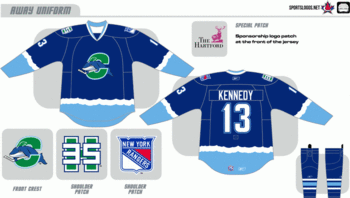
Pros: Despite the largely negative reception it's received so far, we really enjoyed Connecticut's away jersey this past season. The frothing white wave crests along the sleeves and waist are unique and an eye catcher, truly giving a real impression of what the title of "whale" would normally only imply. The light blue trim around the white collar and lettering also adds an extra something.
Cons: It's a pathetic logo, we'll admit that much, and in drastic need of a complete re-creation. The whale would be bad by itself, and so would the "C." Together, they're twice as horrible.
11. Colorado Eagles (CHL) 2005-06 Away
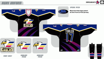
Pros: Without question, we absolutely liked the three purple-fading-to-indigo claw marks on the main body of the jersey. They were nearly the sole cause of it's inclusion in our favorites.
The zig-zag yellow (yellow?) and white line seperating the navy blue upper sleeve from the midnight black lower sleeve and torso of the uniform is also a good feature, as is the spike on each number.
Cons: The logo is really pathetic; it looks like they took the mediocre eagle logo, the pointless and stupid three-colored flag logo, and the intimidating text logo and dragged them together on top of each other. We also weren't fond of the dull and uneventful navy blue shoulders - we would've appreciated some little claw marks on, say, the ends of the sleeves.
10. Milwaukee Admirals (AHL) 2007-08 Alternate

Pros: The dominant yet not overpowering light blue is really cool, and in more than one way. We also appreciated the perabola-shaped black line across the front that helps attract more eyes to the solid blue space, and the brotherly Milwaukee Brewers catching mit just below the right shoulder. The skeleton logo may be quirky and a bit irrevelevant to the team name, but it's interesting in it's own way, too.
Cons: Even without a completely unique twist, this jersey stands out as a great one. We did notice a bit of a resemblance to the Pittsburgh Penguins' alternate outfit.
9. Reading Royals (ECHL) 2008-09 Away

Pros: The Los Angeles Kings have already proven that purple on black looks good, but now the Reading Royals have shown us that white with a touch of purple on black is also a great combination. The white lines somewhat along the sides is quite neat, as is the gray and purple stripes added to it below the numbers.
Cons: We have no real complaints with this outfit, though a small, new original feature might've been nice.
8. Manitoba Moose (AHL) 2007-08 Away

Pros: We greatly enjoyed the color scheme here, not only for making a fantastic jersey but also because they're so relative to the name of the team and where it's located. The funny wing-like things on the numbers are interesting, also.
Unfortunately though, the AHL has confirmed that, with the NHL's expansion to Winnipeg, the Moose are now relocation to St. John's, Newfoundland, so we won't be seeing any more of this jersey anytime soon.
Cons: For some reason, we thought the never-ending sea green stripe across the shoulders and tops of the sleeves was a little overwhelming. A few stripes in that area would've been appreciated.
7. Quad City Mallards (CHL) 2010-11 Home

Pros: There is truly a lot to love about this jersey, which is, as implied by the ranking, the best we've mentioned so far. Despite the typically disastrous circle-with-writing in the logo, the realistic and not cartoony duck is nice. Even the mallard's head and neck in the alternate logo works well with us.
We also thought the curved stripes along the ends of the sleeves including not two, not three, but four colors was a huge eye-catcher, and agreed that the multiple shades of trim around the numbers adds something else to the uniform.
Cons: Another four-color tangle like there is on the sleeves would've been a big improvement to add to the waist, instead of the boring black stripe.
6. Springfield Falcons (AHL) 2006-07 Away
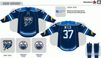
Pros: It's a plus-one for the talons on the arms in our book. What an original feature!
We also enjoyed the curving blue-black-white-black-blue combination of stripes along the waist and mid-sleeves; a good color scheme combined with good placements and design make them memorable. We liked the fact that the still well-defined numbering and nameplate wasn't overwhelmingly bold.
Cons: Even though it doesn't have quite enough incredible parts of it to make it one of our favorite few, there are no true cons of Springfield's outfit here. It's great work.
5. Gwinnett Gladiators (ECHL)

Pros: Oh, where to start! The logos - the front one as well as the alternate on the shoulders - are top-class, it's not too cheesy, not too formal, not too simple, not too complex, and perfectly exemplifies the team.
The curved stripe along the mid-sleeve that's "corraling" the fading-out red patch is great, the black along the sides fits well with the tan theme, and the fading-in red along the waist makes the entire jersey attractive.
Cons: Our only dislike on Gwinnett's jersey here are the half-black, half-white rows of diamonds. They make the sleeves over-the-top crowded and are just useless on the waist, as well.
4. Ontario Reign (ECHL) 2008-09 Away

Pros: Even with the dark, deep navy blue headline color of this uniform, the appearance of white and gray help balance it out. What we liked even more about the white and gray, though, is the fading. This particular new-age style is one that deserves keeping, and the Reign show us why.
Outlining it all is a simple orange, that adds some eye-catching flair to an otherwise colorless theme. We particularly enjoyed it surrounding the interesting font of the numbering.
Cons: We would've rather seen the alternate shoulder crest logo shown as the main one, but with both being so good, we won't complain. The numbers on the shoulders also seemed a little unnecessary on this outfit, even though we've liked them on previously ranked jerseys.
3. Stockton Thunder (ECHL) 2005-06 Away

Pros: Well, I don't think we actually needed to tell you the name of "Thunder" in this slide's title. The jersey lets you know of that right away, and we realy like it. Plus, not only is the white lightning bolt the main feature representing the theme, we also noticed it's black outline and the yellow numbers also have the same zig-zag borders.
We appreciated the front logo being on the small side, despite it's interesting quality of it's own, since it really headlines that spectacular lightning bolt.
Cons: What's the deal with the black rectangle stretching from shoulder to shoulder? Not only is it not very noticeable and not adding anything to the design, it's the only thing getting in the way of the bolt!
But, don't get us wrong; we really liked the whole thing.
2. Idaho Steelheads (ECHL) 2006-07 Away

Pros: Talk about geographical representation. The Steelheads here have the local topography - forest - and industy (which is also their team's title) - steel - mixed into one design. Furthermore, we loved both parts of it. The blue forest in the night sky was eye-catching, but then, looking at it another way, you can easily see the "steel claw" reaching down and scraping at the waist.
The whole jersey could survive just fine without any logos at all, but, nonetheless, we had no problem at all with either of them.
Cons: Removing that ever-annoying black rectangle that stretches from shoulder to shoulder would've been nice, as well as perhaps putting some white trim around the collar. We were torn on whether the claw should've been continued on once reaching the back side, though.
What do you think?
1. Laredo Bucks (CHL) 2004-05 Away

Pros: This is it; our favorite jersey of the minor leagues of hockey. Surprised? Well, after all, it is a CHL team, and they are located in Texas.
However, it's still a jaw-dropping jersey. The antlers that encompass the waist and sides of the body of the jersey are just great, and they even make a little re-appearance on the underside of the sleeve. These were the primary reason for Laredo's rise to the number one spot.
The tan shadow of the dark blue numbers make those stand out, too - something that's very hard to do - and we also sufficiently liked the not-exactly-parallel stripes on the ends of the arms.
Cons: To tell you the truth, the stripe of stars along the waist could've been removed. Yet, still, we can put that aside. This entire uniform is pretty hard to beat. It's a winner, for sure.